
| Author | Message | ||
|---|---|---|---|
< PRODIGY MUSIC / GENERAL ~ Prodigy fan-Zine by el Fifer: Bull in a Basement |
|||
|
|
|||
 General General Posts: 2753Location: Amsterdam, NetherlandsJoined: Tue Nov 21, 2006 7:00 pm Posts: 2753Location: Amsterdam, NetherlandsJoined: Tue Nov 21, 2006 7:00 pm
|
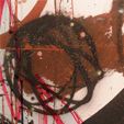
Ok guys so I've been working on this typography project, it's turned out more like an artists book than a zine but what ever, it's looking slick as fuck!
I've attempted to express the energy of the music through typography, with around 2000 words and 16 pages that consist of favourite quotes, etc from various sources (but found on this forum through one handy thread, cheers guys). The cover and centre pages, a four page fold out spread, are printed on cardboard stock that's roughly 300gsm. I've uploaded the book in PDF format and also a presentation sheet with the physical book photographed, with some more in depth details on the concept of the thing. Please take some time to have a look at it, have a read and give me some feedback! If anyone is actually interested in buying one I'm thinking about making 20 or so, depending on interest! Cheers guys! Complete book as PDF - 5.6MB Code: http://rapidshare.com/files/380138203/PAGES.pdf Photographs of the physical book - 5.5MB Code: http://rapidshare.com/files/380138201/ZINE_PHOTO.pdf
Here is the front cover and a couple of double page spreads in a lower quality than the PDF version to wet your appetites: 


|
||
| Top |
|
||
|
|
|||
 Captain Captain Posts: 644Joined: Sat Oct 31, 2009 5:12 am Posts: 644Joined: Sat Oct 31, 2009 5:12 am
|
This is great stuff man! Congratulations on getting that finished, it was fun to read. Respect!
|
||
| Top |
|
||
|
|
|||
| GeneralPosts: 2753Location: Amsterdam, NetherlandsJoined: Tue Nov 21, 2006 7:00 pm
|
Thanks for the feedback man! Appreciate it

|
||
| Top |
|
||
|
|
|||
 GeneralPosts: 1351Location: Manchester, EnglandJoined: Wed Oct 04, 2006 9:32 am GeneralPosts: 1351Location: Manchester, EnglandJoined: Wed Oct 04, 2006 9:32 am
|
Looks pretty good man for a Uni project... a few constructive typography things though watch those loose widows, use hanging indents for quotation marks and turn off your hyphenations on the whole thing.
Don't mean to sound like a dick but those things are essential with typography and layout and if you don't know what they are... kick your tutor somewhere hard for not showing you!
|
||
| Top |
|
||
|
|
|||
| GeneralPosts: 2753Location: Amsterdam, NetherlandsJoined: Tue Nov 21, 2006 7:00 pm
|
That's kool man! I've not done much work on the hardcore ins and outs of typography, we were suppose to tackle that last year but time constraints meant we couldn't!
Thanks for the feedback though man, what is it you do exactly? I assume you have a career in design?
|
||
| Top |
|
||
|
|
|||
 ColonelPosts: 935Joined: Tue Mar 11, 2008 11:29 am ColonelPosts: 935Joined: Tue Mar 11, 2008 11:29 am
|
with some pictures, this would look awesome, but thats probably too much work, right? im not moaning, just "dreaming"... now for the critique
too much yellow for my taste, one or two pages in a light blue, pink or red would round it up. summa summarum: decent work
|
||
| Top |
|
||
|
|
|||
 Corporal Corporal Posts: 320Location: italyJoined: Sun Apr 13, 2008 6:59 pm Posts: 320Location: italyJoined: Sun Apr 13, 2008 6:59 pm
|
i'm not a design expert
but i like its vibe! really nice done
|
||
| Top |
|
||
|
|
|||
| GeneralPosts: 1351Location: Manchester, EnglandJoined: Wed Oct 04, 2006 9:32 am
|
Fifer wrote: That's kool man! I've not done much work on the hardcore ins and outs of typography, we were suppose to tackle that last year but time constraints meant we couldn't!
Thanks for the feedback though man, what is it you do exactly? I assume you have a career in design? No problem, trying to be constructive and not sound like a twat but then you can only learn i guess if someone points it out I co-run a design studio in Manchester, graduated about 8 years ago now... but still an enternal student! Be nice if you screenprinted some of the pages as a poster as well
|
||
| Top |
|
||
|
|
|||
| GeneralPosts: 2753Location: Amsterdam, NetherlandsJoined: Tue Nov 21, 2006 7:00 pm
|
subtract wrote: Fifer wrote: That's kool man! I've not done much work on the hardcore ins and outs of typography, we were suppose to tackle that last year but time constraints meant we couldn't! Thanks for the feedback though man, what is it you do exactly? I assume you have a career in design? No problem, trying to be constructive and not sound like a twat but then you can only learn i guess if someone points it out I co-run a design studio in Manchester, graduated about 8 years ago now... but still an enternal student! Be nice if you screenprinted some of the pages as a poster as well By no means man, good advice is golden! I'm open to all the knowledge I can get so thanks. I'm envious of your job man! I'll hopefully graduate with a BA in Visual Communication by this time next year! Well, I will graduate should I say! I only hope that my portfolio is good enough to land me a job. I landed the opportunity to study in India for three weeks in September last year, plus a few placements lined up for this summer so fingers crossed I'll get something. Bit worried though with the current economic situation, I've been doing a bit of research into the respective parties involved in the general election concerning the creative industries. But it's been a pain in the arse. Most of the stuff applies to England rather than Scotland so I'm a little in the dark, still no idea who to vote for. I briefly thought the same thing with screen prints, doing certain pages in a larger format or something but never though of a poster or larger piece. Might look good in the folio, cheers for the idea man! @Warp3: Thanks man, appreciate the suggestions also but this thing is done and dusted now, don't have time to go back and edit it! It's all formatted into a printable state so it would be more work than it's worth ultimately. It's hard to judge the overuse of colour until you see the actual thing in your hands. The middle pages are printed on card so the yellow bleeds into it, creating a different colour that breaks up the flow a bit! Perhaps I'll do some sort of fan book, not typography based in the summer. Like an A5 magazine publication or something! @Paolocar88 Cheers mate
|
||
| Top |
|
||
|
|
|||
 ColonelPosts: 894Joined: Sat Sep 02, 2006 10:45 am ColonelPosts: 894Joined: Sat Sep 02, 2006 10:45 am
|
love this artwork style mate. maybe you could design my next ep artwork or something if your up for it?
|
||
| Top |
|
||
|
|
|||
| GeneralPosts: 2753Location: Amsterdam, NetherlandsJoined: Tue Nov 21, 2006 7:00 pm
|
Thanks man! just give me a shout at
info@robbiekerrdesign.co.uk I'm finished for the summer in about 4 weeks so I'll have plenty of spare time on my hands!
|
||
| Top |
|
||
All times are UTC
|
Page 1 of 1
11 posts |
|---|
Users browsing this forum: No registered users and 4 guests


| You cannot post new topics in this forum You cannot reply to topics in this forum You cannot edit your posts in this forum You cannot delete your posts in this forum You cannot post attachments in this forum |
Powered by phpBB® Forum Software © phpBB Group
Original 2.x design by Mike Lothar // Ported to 3.x by CiC and will_hough
Original 2.x design by Mike Lothar // Ported to 3.x by CiC and will_hough