
| Author | Message | ||
|---|---|---|---|
< PRODIGY MUSIC / GENERAL ~ Luke & Paul Insect (IMD Artworks) |
|||
|
|
|||
 General General Posts: 2430Joined: Sun Sep 03, 2006 9:33 pm Posts: 2430Joined: Sun Sep 03, 2006 9:33 pm
|
http://www.insect.co.uk/
http://www.lukeinsect.com/ http://www.insect.co.uk/2004/ http://www.iloveartbastard.com/ab_porta ... ukedavies/ 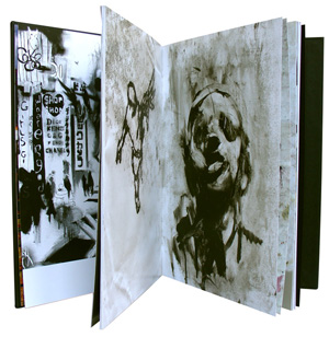
|
||
| Top |
|
||
|
|
|||
 GeneralPosts: 1730Joined: Mon Jan 22, 2007 6:12 pm GeneralPosts: 1730Joined: Mon Jan 22, 2007 6:12 pm
|


|
||
| Top |
|
||
|
|
|||
 GeneralPosts: 2881Location: ESTJoined: Tue Jan 22, 2008 3:30 pm GeneralPosts: 2881Location: ESTJoined: Tue Jan 22, 2008 3:30 pm
|
! Invaders Must Die !
|
||
| Top |
|
||
|
|
|||
 GeneralPosts: 1430Location: HungaryJoined: Sat Aug 30, 2008 7:04 pm GeneralPosts: 1430Location: HungaryJoined: Sat Aug 30, 2008 7:04 pm
|
oh my fuck!
these are all good! |
||
| Top |
|
||
|
|
|||
 Prodigious ArabPosts: 4204Location: The Dark SideJoined: Sun Sep 03, 2006 5:22 pm Prodigious ArabPosts: 4204Location: The Dark SideJoined: Sun Sep 03, 2006 5:22 pm
|
RWTP wrote: oh my fuck!
these are all good! Yeah :D some of them are actually better than the official cover Btw, just curious but is this the 10th time you change your username? I remember it being Bart, then UUU Bart then UUU BBB then run with the piranas and now RWTF Whats up with that? |
||
| Top |
|
||
|
|
|||
| GeneralPosts: 1430Location: HungaryJoined: Sat Aug 30, 2008 7:04 pm
|
Electronic_Punk® wrote: RWTP wrote: oh my fuck! these are all good! Yeah :D some of them are actually better than the official cover Btw, just curious but is this the 10th time you change your username? I remember it being Bart, then UUU Bart then UUU BBB then run with the piranas and now RWTF Whats up with that? Well, I always find a new (better) name. Thats it. |
||
| Top |
|
||
|
|
|||
 GeneralPosts: 2504Location: NorwayJoined: Sat Sep 02, 2006 5:27 pm GeneralPosts: 2504Location: NorwayJoined: Sat Sep 02, 2006 5:27 pm
|
The artwork reminds of what Chemical Brothers did in the Surrender era!
|
||
| Top |
|
||
|
|
|||
 GeneralPosts: 1351Location: Manchester, EnglandJoined: Wed Oct 04, 2006 9:32 am GeneralPosts: 1351Location: Manchester, EnglandJoined: Wed Oct 04, 2006 9:32 am
|
Gotta say im not that impressed with some of these, They look a bit rushed compared to some of Insects other more layered work. They have gone for the Banksy screenprint style effect but its been done to death by so many bands! It doesn't feel fresh, i do like the new logo though and think that rocks but i dont think it sits well with the tracklisting and title font.
Their last album was done by House@Intro who is a fucking genius, but also very expensive. This looks to me like its been done on a tighter budget and looks cheaper than anything that would of been done on XL recordings. Its not consistant either, the Omen single uses a photograph and the album cover doest, look at AONO singles and as a set they look fucking amazing together.
|
||
| Top |
|
||
|
|
|||
 GeneralPosts: 1296Joined: Wed Sep 06, 2006 9:49 am GeneralPosts: 1296Joined: Wed Sep 06, 2006 9:49 am
|
subtract wrote: Gotta say im not that impressed with some of these, They look a bit rushed compared to some of Insects other more layered work. They have gone for the Banksy screenprint style effect but its been done to death by so many bands! It doesn't feel fresh, i do like the new logo though and think that rocks but i dont think it sits well with the tracklisting and title font.
Their last album was done by House@Intro who is a fucking genius, but also very expensive. This looks to me like its been done on a tighter budget and looks cheaper than anything that would of been done on XL recordings. Its not consistant either, the Omen single uses a photograph and the album cover doest, look at AONO singles and as a set they look fucking amazing together. +1 |
||
| Top |
|
||
|
|
|||
 GeneralPosts: 2753Location: Amsterdam, NetherlandsJoined: Tue Nov 21, 2006 7:00 pm GeneralPosts: 2753Location: Amsterdam, NetherlandsJoined: Tue Nov 21, 2006 7:00 pm
|
Yea AONO sits well as a set but it was a hardly a fantastic album design was it? especially the singles, they looked horrible in my opinion.
|
||
| Top |
|
||
|
|
|||
| GeneralPosts: 1351Location: Manchester, EnglandJoined: Wed Oct 04, 2006 9:32 am
|
Fifer wrote: Yea AONO sits well as a set but it was a hardly a fantastic album design was it? especially the singles, they looked horrible in my opinion.
In my opinion they worked well, they looked a lot more refined and polished design wise than IMD, mostly because Intro are a top design agency This just looks cheap and basically predictable, one of the best album covers ever made and still gets ranked highly now is Fotl, because its iconic and jumped out of the record shop and caught your attention. IMD just looks run of the mill, which is a shame as so much more could of been done given the quality of tracks on there
|
||
| Top |
|
||
|
|
|||
| GeneralPosts: 2753Location: Amsterdam, NetherlandsJoined: Tue Nov 21, 2006 7:00 pm
|
I agree with most of your points there mate, fotl is ofcourse Iconic. To create an icon is an extremley difficult thing to do in the world of graphic design. Only thing is they've achieved that and they probably wanted something fresh.
I agree that the whole graphics surrounding IMD are pretty weak. I do like the IMD logo and feel that would have possibly been a better choice for the album cover on a black background. Some may have called it lazy but those words have an impact, when sat on a shelf that would deffinetly catch my eye. Either that or just some untapped/slightly modified posters from the early space/invader film scene. Some stuff they braught out early on was sweet as nut. They've just went a bit over the score with photoshop and came up with something that looks a bit bland and well..... not very unique.
|
||
| Top |
|
||
|
|
|||
| GeneralPosts: 2881Location: ESTJoined: Tue Jan 22, 2008 3:30 pm
|
Fifer wrote: those words have an impact, when sat on a shelf that would deffinetly catch my eye.
indeed. main thing is done with these words. for me its totally fresh and main theme goes well with the title message
|
||
| Top |
|
||
|
|
|||
 GeneralPosts: 3856Location: USAJoined: Sat Sep 02, 2006 6:56 pm GeneralPosts: 3856Location: USAJoined: Sat Sep 02, 2006 6:56 pm
|
maybe the album will be one of those with the slip case over it. always thought that would be cool. like the Justice live CD/DVD release. have the casing be the simple font against black background and the actual CD be the cover we now know.
who knows until it's out.
|
||
| Top |
|
||
|
|
|||
| GeneralPosts: 1351Location: Manchester, EnglandJoined: Wed Oct 04, 2006 9:32 am
|
Fifer wrote: Either that or just some untapped/slightly modified posters from the early space/invader film scene. Some stuff they braught out early on was sweet as nut. They've just went a bit over the score with photoshop and came up with something that looks a bit bland and well..... not very unique. Exactly man the space/invader theme was ace, the new T with the B-Movie type poster graphics really worked and could of developed into something clever. Just a missed opportunity i think, some people will love it with its references to destruction/war/guns and all that shit but to me its cliche'd
|
||
| Top |
|
||
All times are UTC
Users browsing this forum: No registered users and 15 guests


| You cannot post new topics in this forum You cannot reply to topics in this forum You cannot edit your posts in this forum You cannot delete your posts in this forum You cannot post attachments in this forum |
Powered by phpBB® Forum Software © phpBB Group
Original 2.x design by Mike Lothar // Ported to 3.x by CiC and will_hough
Original 2.x design by Mike Lothar // Ported to 3.x by CiC and will_hough